Lessons in Design Thinking: #2 Measuring the ROI of UX design
There are multiple examples in online commerce where effective UX design has been at the forefront of disruptive innovation; consider the likes of Amazon, Apple, and Ocado…
All three retailers experienced exponential growth and success because they are UX-centric businesses that place value on engaging design and seamless customer experiences.
Despite the obvious commercial benefits of making design a key strategic investment, as demonstrated by these market leaders, we often hear that SMBs are looking to focus their eCommerce budgets on technology, development, analysis, and testing. Design is rarely the no.1 priority, if a priority at all. In addition to our own observations, Forbes (2019), found that start-ups often fail due to a lack of empathy and understanding of customer requirements.
So let’s consider what a designer does. Designers themselves focus on communicating from the perspective of your customer. They drill-down on empathy, the experience, the aesthetics and the emotions of your customer. This is why in our workshops, we always ensure that when we’re talking about UX in terms of facts and figures and most importantly, monetary terms.
However, we know that not all designers communicate in this way. It’s understandable that this inability to adhere to the age-old adage ‘money talks’ can make it difficult for SMBs (and sometimes even larger retailers) to attribute a return on investment to design activities. So, how can online businesses more accurately estimate this?
The process can best be explained in three steps (simplified for the purpose of this blog!):
1. Identify site pains and gains
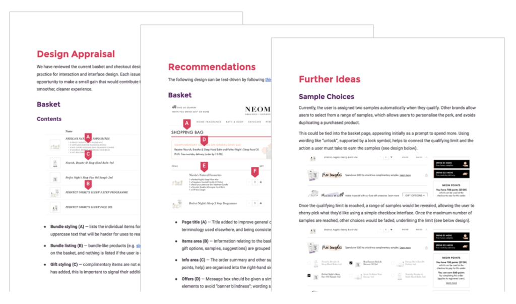
A thorough site audit will drill-down on the parts of the buying journey that aren’t performing as well as they should be. The pitfalls we have encountered most often include:
- Cluttered appearance that feels unprofessional
- Poor support for mobile device constraints
- Site architecture that is difficult to traverse
- Lack of trust building elements to combat common doubts
- Overcomplicated checkout process that trips users up
- Siloed informational content (i.e. no sizing guides on product pages, styling tips or how to’s)
2. Estimate the financial impact of the identified UX shortcomings
If you’re about to embark on a new project with an agency, they should be talking about your commercial goals! We’re often challenged on this, but it is our job to justify your investment into a redesign by estimating the financial impact of the found issues and the potential benefits of solving them. This is calculated through observing your site analytics in connection with your financial results. Done right, you should be presented with how much revenue you’re losing out on due to the UX issues found in Step 1.
3. Communicate through hypotheses
Rather than simply creating a list of UX improvements and designing some nice-looking wireframes of how it could be made more visually appealing, the designer should be putting forward a hypothesis on how much value undertaking their design will return — AKA your ROI!
As an example, it should read something like this:
“According to our analysis, the suggested UX improvements could help us in two ways. First, we can increase revenue through an improved User Experience. We’ve explored the potential effects and found that even our minimum estimation of a 0.5% uplift in conversion rate would lead to £800k revenue increase per year. Our clients, X, Y, and Z, had similar site issues and once rectified, had results within this ballpark.
Secondly, an improved UX experience will save on time and operational costs. Our projections show that we could save you three working days per designer per month, which we could invest in other projects. Your internal design team has 10 members, and if we assume a £50 hourly rate, this is equivalent to £150k in saved time.”
Key Takeaway: Think about design in terms of numbers, not just visual wireframes. It is possible to calculate the potential ROI of an improved User Experience for your eCommerce site – and the revenue and growth you could unlock may surprise you!
If you’re an online merchant looking to invest in UX design, we offer full site audits and discovery workshops where we will work through the three step process with you. If you’d like to learn more, get in touch with our Head of Design, Joseph Russell: joe@wearejh.com

