Awwwards Amsterdam 2019 – Digital Thinkers Conference

A fair amount of the winning (Site of the day etc.) work submitted for the Awwwards jury scrutiny can be experimental and be for brands who are willing to sacrifice a little conversion to the benefit of their story, sometimes going against the norms of accessibility and usability.
As much as I love experimental patterns, editorial layouts, WebGL, so and so forth, I primarily create designs and experiences for clients who are mainly concerned with two things, conversion and lifetime value.
I needn’t have worried.
Hand on my heart, I can honestly say I walked away with something from each speaker. More than anything I came away reinvigorated and reminded that chasing numbers and not great experiences is bad for the soul.
The majority of the web hasn’t changed in the last five years. Both physical and digital spaces have been beige for a long time.

I think Peter Smart from Fantasy and Daan Klaver from Build in Amsterdam summed it up best.
So much of digital product is about user transaction design, not user experience design. But when you truly design for humans, the measurable results speak for themselves.
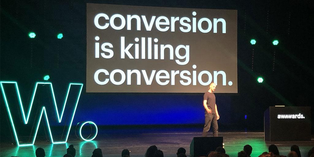
Concentrating on the immediate and short term numbers is killing conversion. If we focus on making our experiences enjoyable and as unique as possible, the long-term will look fruitful.
I couldn’t recommend this and other design conferences in general enough. You’re not alone in your plight to make experiences enjoyable and exciting, be heard and keep up the good fight.
What and who I learned the most from
Peter Smart
Spoke about how we’re concentrating on the numbers too much to the sacrifice of enjoyable experiences.

Daan Klaver
As the founder & creative director of Build in Amsterdam, Daan gave us his top 12 tips. I won’t list all the tips out here, but the first tip was “don’t pitch”. We’re hurting ourselves, and no other service requires the first % of work done for free before hiring.
Marie van Driessche
Marie showed us that the general population, label people who have hearing difficulties as disabled. This community does not see themselves as disabled.
To help your users make sure to:
• Use easily accessible language whenever possible
• Write in a journalistic style: make your point and then explain it
• Write in an active form
• Avoid unnecessary jargon and slang, which can increase the user’s cognitive load
Claudio Guglieri
Claudio not only spoke about general accessibility and what a user can see but also what a user can do or is capable of doing efficiently while the device is in hand (mobile device) or over your eyes (VR). Design for inaccuracy. Use all the information available to identify intent.

Andy Thelander
Probably best known for their work with the Harry Potter brand, Andy from Active Theory walked us through how the Active Theory team work and how they’ve continuously improved the look and feel of their website over time.
Jean-François Chainé & Dust Leblanc
Creatives are fickle creatures, and there is a growing trend (beyond California) for creatives to spend 2 or 3 years in a role and move on. Locomotive gave definitive answers to questions like:
• How do we keep these people motivated and hungry for creativity?
• How do we bond them together?
• How do we create a positive work environment for them to learn and evolve?
The simple answer is to hire someone who will fit in and doesn’t just have the skillset required, trust your employees, back them up when needed, support them and give them the best environment to work in.
Raisa Cuevas
Reminded us all that the future of the web is PWA and that performance is key to improving your user’s experience and increasing the likelihood of engaging our customers again and again.
Martijn van der Does
Founder of Wonderland — “All children are born artists. The challenge is to remain one when you grow up. Creativity is extremely important for our future.”